JÖNKÖPING UNIVERSITY • HCI RESEARCH & CONCEPT DESIGN • 2025
ROLE
UX Researcher & Designer
TIMELINE
2025
METHODS
Stroop Task, NASA-TLX, Within-subjects experiment
TOOLS
PsychoPy, Figma
OVERVIEW
Smartwatches notify us constantly: calls, messages, reminders, health alerts, with no awareness of what we're doing or how much mental bandwidth we have left. Haptic signals are especially disruptive because they use a separate sensory channel and trigger attention automatically, before we consciously register them. Even when we try to ignore a vibration, our attention has already been pulled.
PROBLEM
Attentional capture research shows tactile and haptic stimuli get processed differently from visual ones. Visual notifications can be passively filtered, but haptic signals interrupt at a lower cognitive level: they're harder to suppress and force a brief reorientation even when you consciously try to ignore them. Cognitive Load Theory calls this extraneous load, effort spent managing the environment instead of the task itself. For smartwatch users trying to focus, every buzz has a small, measurable cost.
"On average, participants needed 3 trials, about 5 seconds, to recover focus after a vibration."
RESEARCH
30 participants completed a within-subjects experiment in PsychoPy. Each was exposed to three notification conditions during a colour-word Stroop task: haptic (vibration), visual (on-screen flash), and control (no notification). Reaction time and error rate were measured per trial. After each block, participants completed a NASA-TLX questionnaire to assess perceived cognitive load across workload dimensions.
580ms
average reaction time, control condition
3 vs 2
trials to recover focus: haptic vs visual
SOLUTION
The redesign uses a three-tier notification system: urgent alerts get haptic plus visual, standard updates are visual-only, and low-priority items are held silently for later. A focus detection layer reads motion and usage patterns to adjust delivery based on estimated cognitive state, and once a focus session ends, a digest surfaces everything that was held so nothing gets lost.
7
smartwatch screens prototyped for the concept design
SET A: PRIORITY & DETECTION

Screen 01
Save the buzz for emergencies

Screen 02
Read the room, then notify

Screen 03
Silence is a feature
SET B: CONTROL & SUMMARY

Screen 04
Save the buzz

Screen 05
Read the room

Screen 06
Give users control
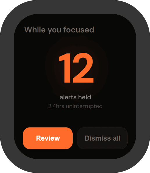
Screen 07
Silence is a feature
DESIGN DECISIONS
01
Three tiers not two
Urgent, standard, and low maps directly to haptic+visual, visual-only, and silent. This gives users precise, graded control instead of forcing an all-or-nothing tradeoff.
02
Auto-adapt not manual
Detecting cognitive load in real time removes the burden from the user. People shouldn't have to remember to switch on focus mode themselves; the system should read context and adapt on its own. Manual settings add friction, automatic ones just work.
03
Digest not dismiss
Grouping held notifications into a post-focus review respects both the sender and the user's attention. Dismissing on silence loses information, but a digest brings it back at the right moment. The goal isn't to hide notifications, it's to time them correctly.
WHAT I LEARNED
The most disruptive feature isn’t always the most visible one.
Haptic notifications are invisible in the usual product sense. There's no badge count, no visual trail. But their effect on cognitive performance turned out to be bigger than more visible cues. It taught me to look past what shows up on screen and pay attention to what's actually disrupting people.
Friction can be a feature when it’s in service of attention.
Most products optimize for engagement, so this project pushed me to think the other way: a short delay, a visual-only mode, a held digest, can actually serve the user better. It changed how I think about what "good UX" means when attention is the resource being managed.