JÖNKÖPING LÄNSTRAFIKEN • UX RESEARCH & REDESIGN • 2025
ROLE
UX Researcher & Designer
TIMELINE
December 2025
METHODS
Think-aloud, Semi-structured interviews
TOOLS
TAM Framework, Figma
OVERVIEW
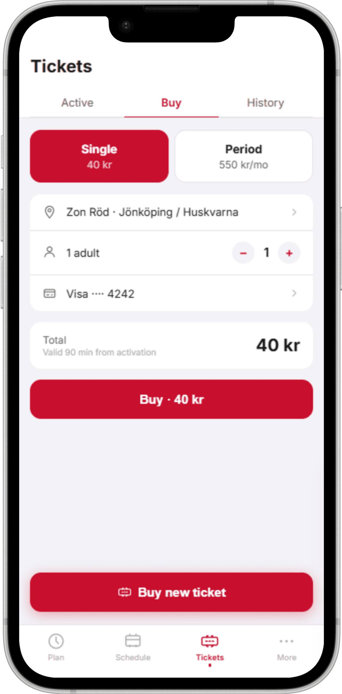
JLT (Jönköping Länstrafiken) is a Swedish regional transit app used by students and commuters in the Jönköping area. When a new user opens it, the app defaults to the Buy screen, not the Plan screen. That one decision, a default landing state, created a barrier between new users and the core functionality they were actually looking for.
PROBLEM
When a new user opens JLT for the first time, they're dropped straight into a ticket purchasing flow. But most users, especially international students unfamiliar with the local transit system, open a transit app expecting to explore routes first. The app's default state matched the needs of returning users who already know how to navigate the system, not the mental model of someone using it for the first time.


RESEARCH
I recruited 6 international students at Jönköping University, all new to JLT, for moderated think-aloud sessions. Participants were asked to complete three tasks: find a route, buy a ticket, and find the next departure. I used a TAM-based framework to evaluate perceived ease of use alongside task completion data.
3 / 6
users verbally questioned whether the app could plan routes at all
SOLUTION
Flip the default. Lead with the journey.
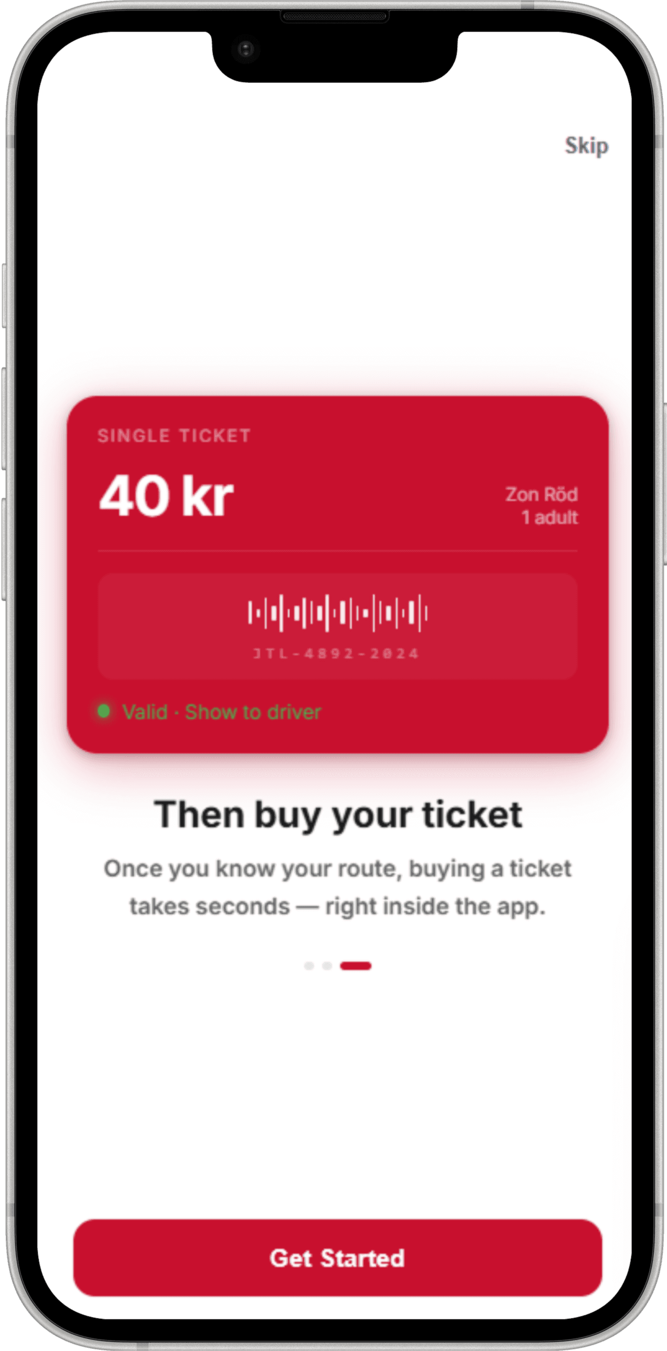
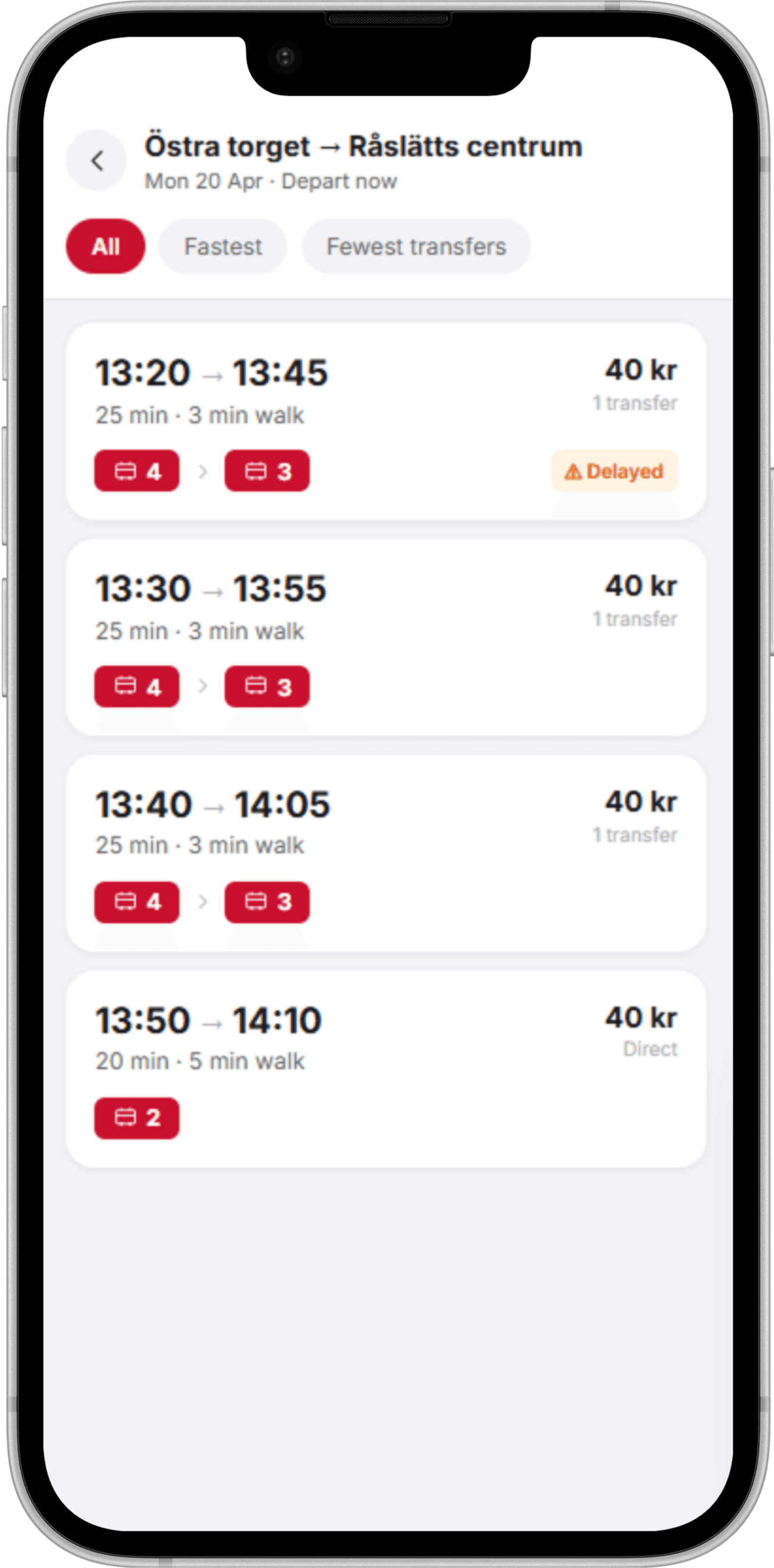
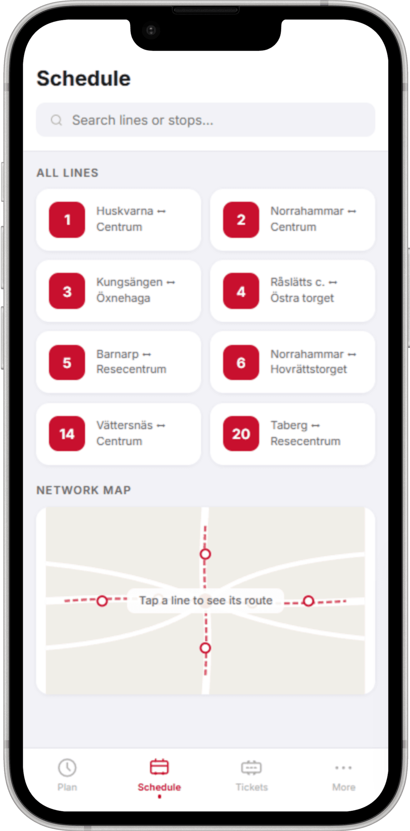
The redesign comes down to one structural change: make the Plan tab the default landing screen instead of Buy. From there, I added a 3-step onboarding flow to reframe the app's purpose before users reach the home screen, and moved ticket purchasing to a secondary tab, still accessible, just no longer the entry point.
BEFORE — JLT default (Buy)
AFTER — Redesigned (Plan)

3-STEP ONBOARDING FLOW
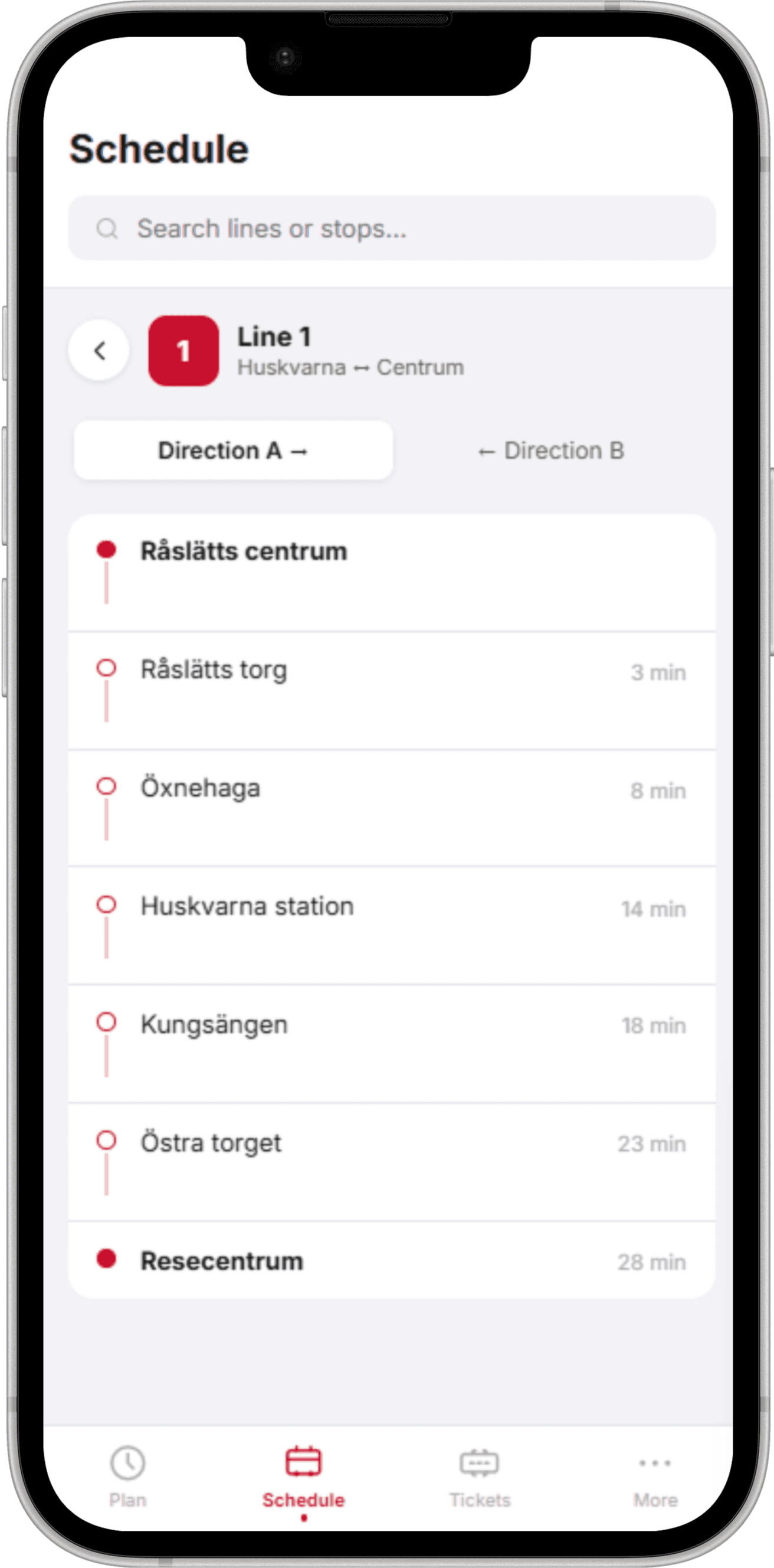
KEY APP SCREENS
DESIGN DECISIONS
01
Journey planning leads, not tickets
6 / 6 users opened the app to plan a route, not buy a ticket. Default screen should match the dominant mental model. Putting Buy first signals the wrong purpose before a user has formed a single habit.
02
3-step onboarding, not a tutorial
Short enough to not feel like homework, just enough to reframe the app as a navigation tool before it hits the home screen. The goal was orientation, not instruction.
03
Tickets demoted to a tab, not removed
Buying tickets is still essential, just not the entry point. It's a secondary path, not a hidden one. Users who already know the app can still reach ticket purchase directly. The tab stays; the default screen changes.
ALL SCREENS





WHAT I LEARNED
The default screen is a product decision, not a technical one.
It told users what the app was for, and getting it wrong meant the app felt like the wrong tool entirely, before anyone had even tried to use it.
Onboarding earns trust before it earns task completion.
First-time users don't need to learn the app right away, they need to be oriented. Three screens were enough to shift that mental model before confusion could work against the task.